Unsplash
Shared by Soraya Sierra:
The fundamentals of understanding color theory. (These are the concepts I would like to explain)
Color theory is both the science and art of using color.
· It explains how humans perceive color
· The visual effects of how colors mix
· Match or contrast with each other
· Color theory also involves the
messages colors communicate
· The methods used to replicate color.
In color theory,
colors are organized on a color wheel and grouped into 3 categories: primary
colors, secondary colors and tertiary colors. More on that later.
The subtractive color mixing model
The color wheel
Understanding the color wheel and color
harmonies (what works, what doesn’t and how color communicates)
Color wheel basics
The first color wheel was
designed by Sir Isaac Newton in 1666 so it absolutely predates your
introduction to it in kindergarten. Artists and designers still use it to
develop color harmonies, mixing and palettes. The color wheel consists of
three primary colors (red, yellow, blue), three secondary colors (colors created when primary colors are mixed:
green, orange, purple) and six tertiary colors (colors made from
primary and secondary colors, such as blue-green or red-violet).
Draw a line through the center of the wheel, and
you’ll separate the warm colors (reds, oranges,
yellows) from cool colors (blues, greens,
purples).
Warm colors are generally
associated with energy, brightness, and action, whereas cool colors are often
identified with calm, peace, and serenity.
When you recognize that
color has a temperature, you can understand how choosing all warm or all cool
colors in a logo or on your website can impact your message.
Hue, shade, tint and tone
Color schemes
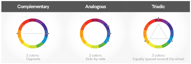
Complementary colors
Complementary colors are opposites on the color wheel—red and green, for
example. Logo
design by Wiell for
Pepper Powered Because there’s
a sharp contrast
Triadic colors
Triadic colors
are evenly spaced around the color wheel and tend to be very bright and
dynamic.
ACTIVITY
1.Warm up activity
Start the class explaining the Burger King logo.
First lets go to talk…
Ask the students talk about different questions.
“Do you know this logo? “”Put your hand
up if you know it? “ “Which colours we have in it?”etc Do you think that
….?What´s your opinion…?
Second Give the KCV ( Key Concept Vocabulary)
Primary colors, secundary colors, tertiary
colors
huge, shade, tint, tone
Color Wheel
subtractive color mixing model
warm colors
cold colors
Color schemes
Analogous colours
Complementary colours
The students should make their own notes and write the definitions.
Third
Fix the information with a vocabulary game.
Fourth
Comparing pictures.
Use the comparatives and superlatives and the
vocabulary.
“The picture on le left uses analogous colors.
The colours are warmer... There is a softer contrast than in the ….”
“The picture on the right has got complementary
colors. There is a sharp contrast. So This picture has a sharper contrast
than…., this picture has got the sharpest contrast I have ever seen before…
Five
Make your own picture and explain it to your colleagues.
https://99designs.es/blog/tips/the-7-step-guide-to-understanding-color-theory/


Comentarios
Publicar un comentario